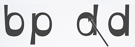
 Typography is a pretty dark art at the best of times, but this new font blew me away. My ten year old son Olly, who is dyslexic, wrote about it on his blog, proving not for the first time, that he knows more than his dad.
The font has been specially weighted to stop the letters flipping over and spinning around, which what happens when dyslexics read regular type, no matter how pretty the kerning.
You can download it for free at opendyslexic.org, with no restrictions on its use outside of attribution. The Daily Mail online will never look the same again…