 Creative Director and Advertising Legend Mark Denton came into IPC media last week, and gave a genuinely inspiring talk about his work to a totally packed house.
Mark has won an astonishing number of advertising and design awards across the spectrum. Press ads, posters, sculptures(!), books and logos, along with a solid stream of self promotional material. All of this has culminated in an exhibition at Leo Burnett, with a documentary and book to follow.
But aside from comic book stylings, excellent jokes and spoof magazine covers (more of that in a minute) what did he tell us, and what did we learn?
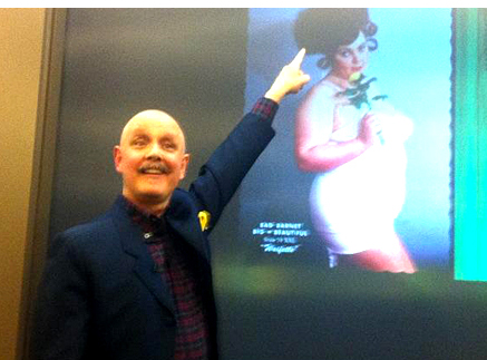
 Mark’s talk made clear the two secrets to his sucess. The first is a willingness to embrace his own direction, his aesthetic corridor, as it were. The second is an absolute commitment to pushing that direction as far and hard as he can. As this self promotional item illustrates.
By his own admission, Mark’s enthusiasm is for schoolboy jokes with a very high level of finish. But after that, his energy in following through is amazing. All the ideas in the presentation seemed to start outside his day job; concepts, random ideas and weird connections. But by passionately driving them forward, they became real enough for others, both collaborators and clients, to buy into the madness.
Here’s yesterday’s fine post by Jim Davies, which details the six big ideas from his IPC talk. And here is how Mark himself explained his approach to Design Week a few months ago:
’Most people go down the pub, come up with crazy ideas, have a laugh, and then think no more about it,’ he says. ’The difference is, I’ll follow it through. And I’ll do it properly, too.’
Design Week’s view of Denton’s style is; ‘Bold pastiche with a retro twist. Harking back to his childhood love of comics and TV, this accounts for his peculiarly British idiom and cultural references’. Pretty accurate, I’d say.
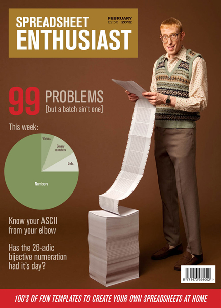
The rewards to this approach can be variable. More ideas must surely fail than succeed. Money has to risked upfront. Clients will always be on the edge of their seat. But get it right, and you’ll knock it out of the park. Product will shift, traffic will rise, awards and glory will follow. I can’t wait for the book, but for now, lets look at his spoof covers from earlier this year.

Ad Week tells us that Leo Burnett copywriter Ben Gough came up with the idea of creating thoroughly undesirable magazine covers to wrap around his copies of the ad trade journal Lurzer’s Archive, which kept getting pinched off Ben’s desk.
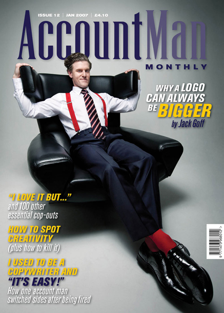
The words are fun, but for Mark and his team to then come in and design something this knowing, this bad, takes real skill. From genius casting to the boring colourway and the functional font, every detail is perfect.
 The covers were a hugely talked about and admired piece of work. The project may be a stunt, but from my point of view it’s a brilliantly effective way of keeping people talking about your brand. Brand Denton.
 This is my favourite of the set. I started designing covers in the eighties, so the font choices feel chillingly familiar. Combined with the nightmarish image, and the crass use of yellow, here is a piece of work that really does explain how advertising creatives regard their account manager peers.
They’re joking, right?