Month: June 2015

Apple’s new system font – ‘The interface is the product’:

Here’s a video from WWDC 2015 where Apple introduce their brand new font, San Francisco. It’s similar to Helvetica, but with several key differences that create a warmer, more gender neutral feel. In my opinion it draws heavily on the success of Proxima Nova discussed on this blog at length a few weeks ago.

Read More

Bloomberg asks the question, ‘What is code?’

This is incredible. Really long, but feels really true. What is code? Coca Cola’s marketing boss on the ‘artificial divide between creativity and effectiveness’. It’s a pretty good story. What’s next for publishers and video, decent roundup here. The end of web design as we know it. Great story about trust in content, my favourite subject.

Read More

The single reason why Proxima Nova is the world’s best font

There’s a good story by on Medium today about Proxima Nova, the font that by many measures has replaced Helvetica as the world’s most popular typeface. Proxima was first drawn by Mark Simonson in 1981, it took a while to gain traction but after the release of Gotham in 2002 it really took off. Fred […]

Read More

How to make your subscriber cover really mean something

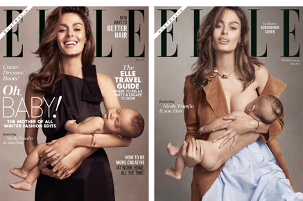
Here’s the June Issue of Australian Elle, which brilliantly demonstrates the value of a split run subscriber cover. According to the editor, this wasn’t planned, it was just that the model needed to breast feed whilst she was on the shoot. So she did!

Read More